Step 1: Empathize. What is the problem?
Charity.org is Global Impact’s online hub for marketing material and organizational information. In 2018, to refresh an old brand; we began discussing an update to our interactive look and feel, and realized we needed our online presence to reflect the new look identity we were coming up with.
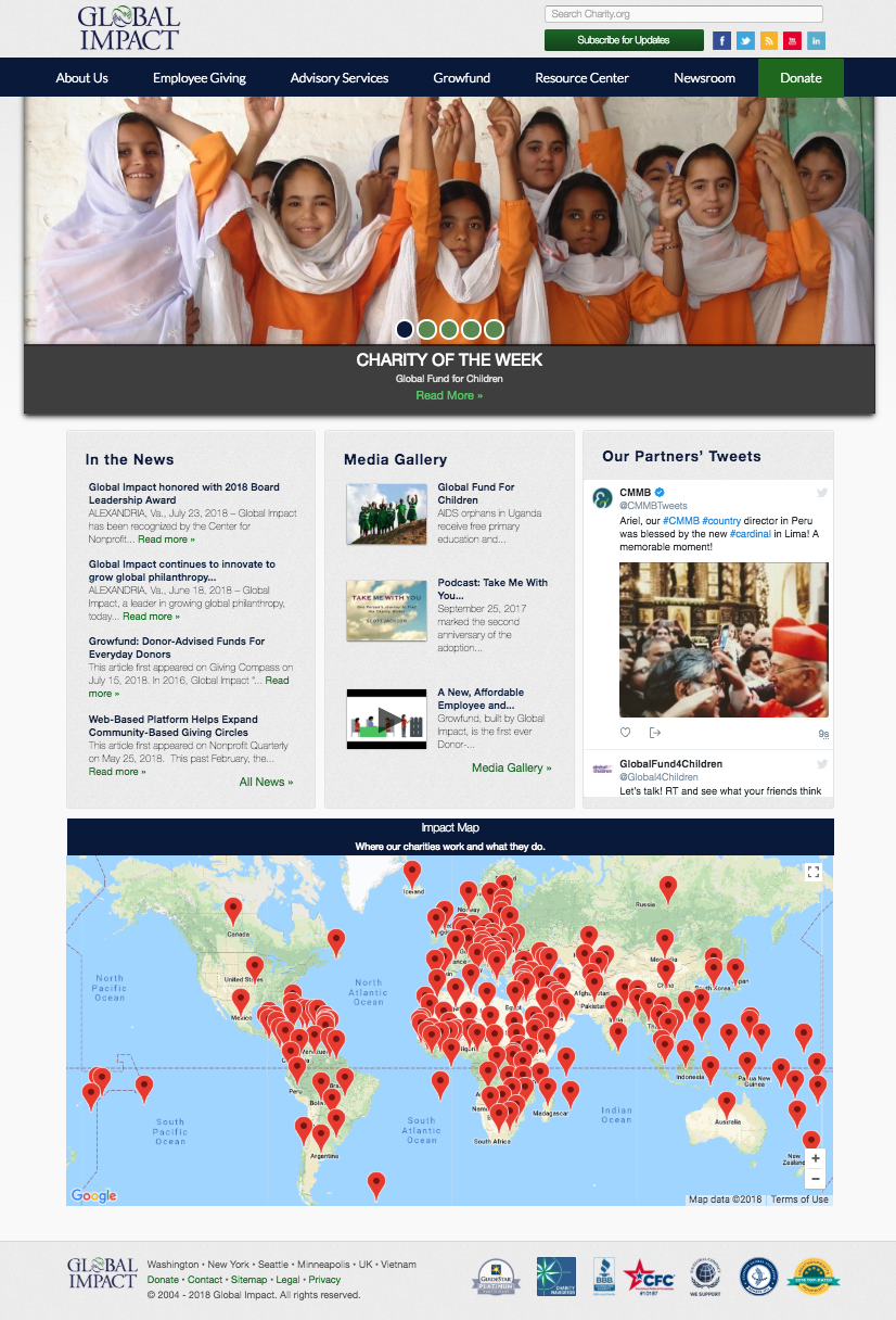
Here is a before …
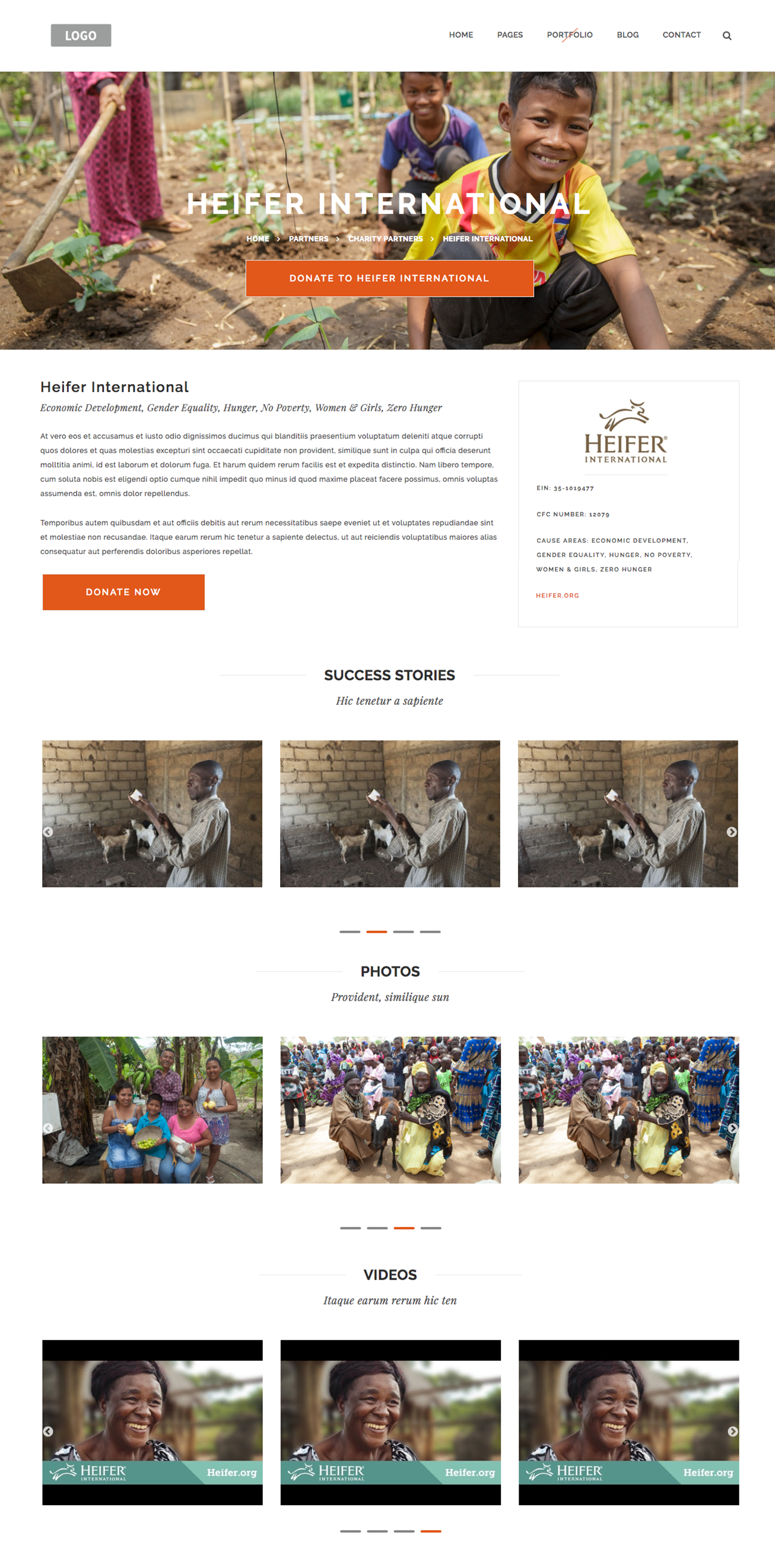
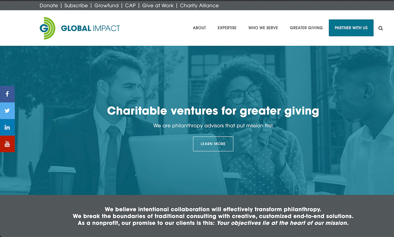
And here is an after …
Step 2: Define. Deeply understanding the problem.
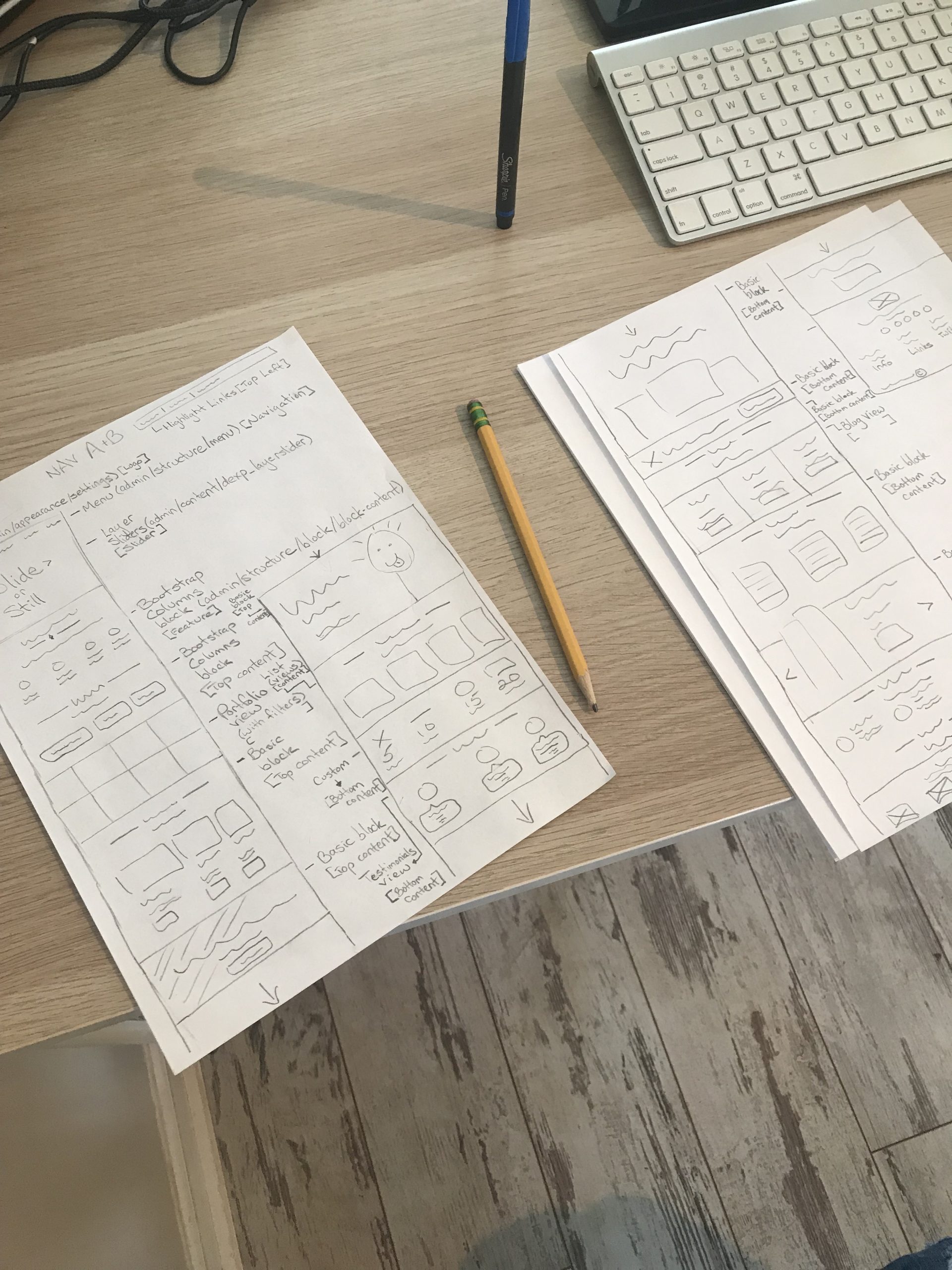
We collaborated weekly for months about what sections of our site needed to really shine, be redesigned, or re-coded. We used analytics and customer feedback to drive the redesign. It was about a 6-month project! We relaunched in the summer of 2019. I was responsible for creating and maintaining the design system during the project, as well as layout design and mobile friendliness. I was also responsible for coordinating with all the departments to make sure everyone’s voice was heard across our business verticals.

Step 3: Ideate. How can we solve the problem? + Step 4: Prototype. Show an MVP than can solve the problem.
We had a ton of content and page layout discussions over the course of the project. There were many opinions, and more than once we had to talk about the why instead of just the what of the redesign.

Step 5: Test. Do real users feel like this would solve the problem?
We saw a steady average of about 100K visitors per year for the preceding years go up to over 150K after our site launch!
My project tool belt: Figma, Photoshop, Drupal, PHP, Atom, GitHub, HTML5/JS, Amazon S3, Heroku


