Empathize. What is the problem?
Why have a design system at all? Well, if you read my blog on design systems, you know that there are multiple reasons; including component reusability, faster concept-to-design speed, and overall brand consistency.
Define. Deeply understanding the problem.
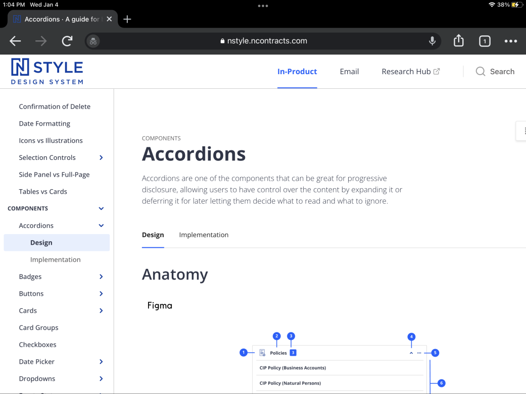
From 2021 to 2022, I was part of an amazing team working on a fantastic design system at Ncontracts. The design system has 4 main parts:
- Styles
- Conventions
- Decision Trees
- Components
Ideate. How can we solve the problem?
The first contains the product color palette & typography, custom icons & illustrations, and data visualization helpers. The conventions show developers common approaches for using the design libraries in context. Decision trees also guide developers in their decision to use one component over another during their build process. And finally, the components house all of the designed single and composite interface possibilities for Ncontracts products.
Prototype. Show an MVP than can solve the problem + Test. Do real users feel like this would solve the problem?
I spent that year helping to update the design system in Figma, Illustrator, GitHub, and Storybook, contributing custom icons & illustrations as well as quick start guides and overall guidance (read: do’s and dont’s) in Nstyle. Our developers absolutely loved being able to have a design template to begin with as we worked through new feature sets. Our designers were happy not to have to reinvent the wheel everytime we needed a component for a new project.
Tools used:


