Step 1: Empathize. What is the problem?
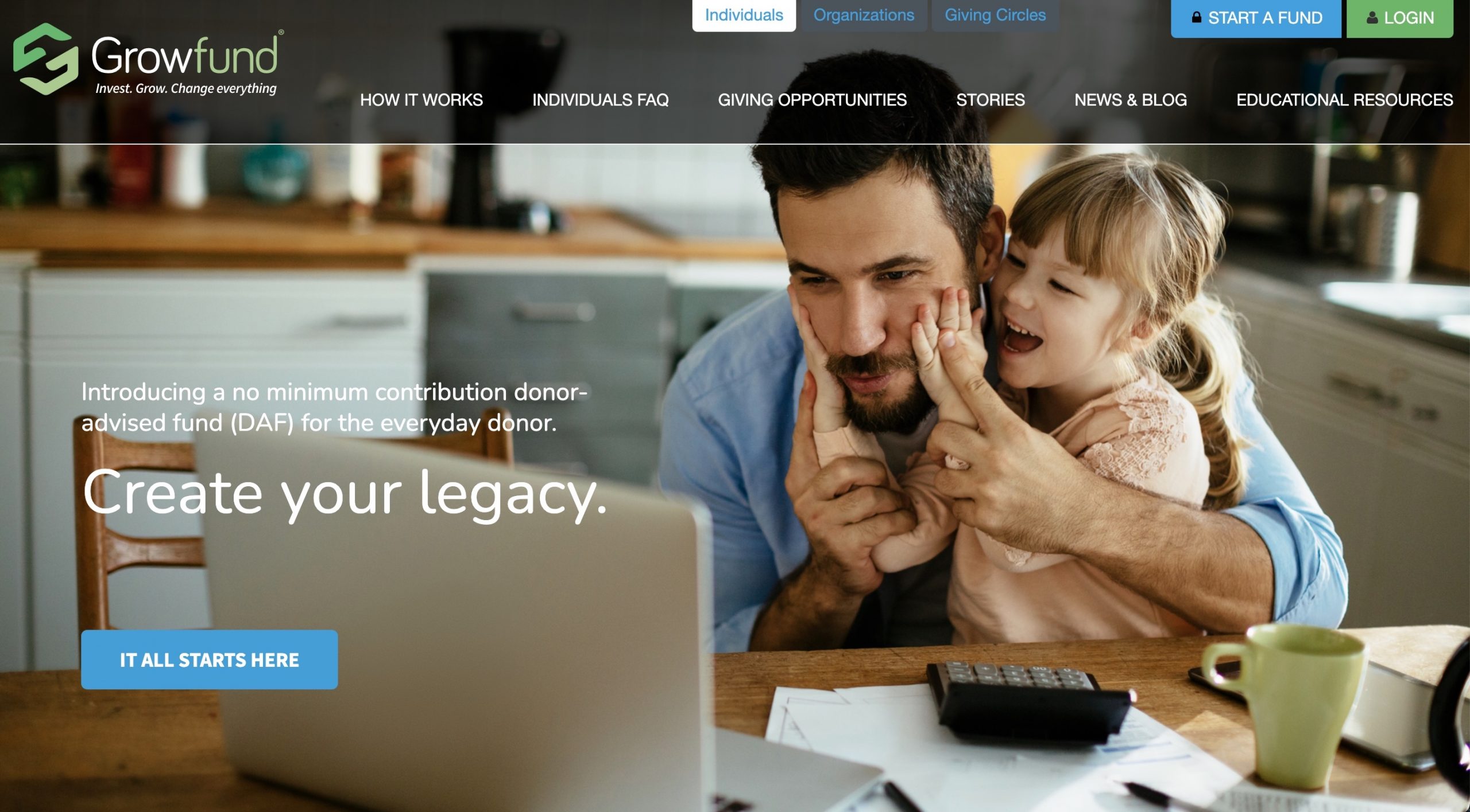
Growfund is a no-minimum contribution DAF (donor-advised fund) product we created at Global Impact to make it easier for the everywoman and everyman to collect funds for giving. Before Growfund, DAF’s were exclusively the domain of the wealthy.
Step 2: Define. Deeply understanding the problem + Step 3: Ideate. How can we solve the problem?
We looked initially at 3 main audiences (individuals, universities, and giving circles) to target and though we had some success with universities, we ended up changing that focus via user feedback and research and introduced organizations as an audience instead in 2020.
In our ideation sessions, we began to understand that we could create a portal for these segmented audiences to login to and grow their DAF through a customized paycheck contribution system.
Step 4: Prototype. Show an MVP than can solve the problem.
I worked with a design agency in D.C. to flesh out pattern libraries, logos, and the look and feel for it and then implemented the live, fully-designed site and tailored 3 different interactive user journeys based on audience for Growfund users.
Step 5: Test. Do real users feel like this would solve the problem?
Over 5 years we had over 40K visitors to the marketing site and around 1K users create accounts on the platform.
My project tool belt: Figma, Illustrator, Photoshop, InVision, GitHub, HTML5/CSS3/JS, WordPress, PHP, Heroku


Leave a Reply
You must be logged in to post a comment.